Product Designer, Oct 2017 - Nov 2021, NYC
UI/UX, Design System, Marketing, Finance
Payability is a leading e-commerce financing platform that has provided over $2 billion in growth capital to 3,000+ marketplace sellers. The company was ranked #6 in fintech and #97 in fastest growing by Inc. 5000, and #10 among NYC's hottest companies to work for.
As the sole designer supporting 30+ developers and 5 product managers, I focused on redesigning existing products, creating new experiences, and conducting UX research. My role expanded beyond product design to include marketing materials, partner prototypes, and internal IT support ranging from network security to meeting A/V setup.
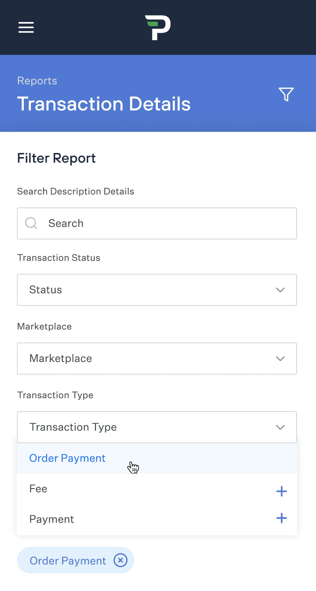
The supplier dashboard enabled customers to manage spending, view available balances, and access advanced reporting. Initially lacking essential features, I optimized the dashboard through customer interviews, support team collaboration, and user behavior analysis. The result was a significant decrease in support calls, leading to higher revenue, reduced churn, and improved user satisfaction.
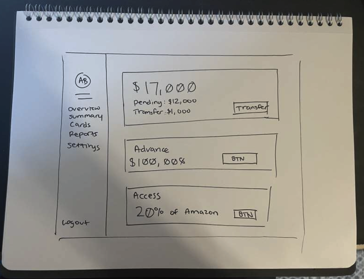
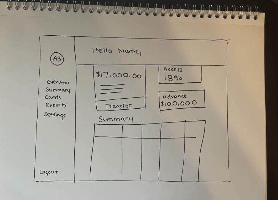
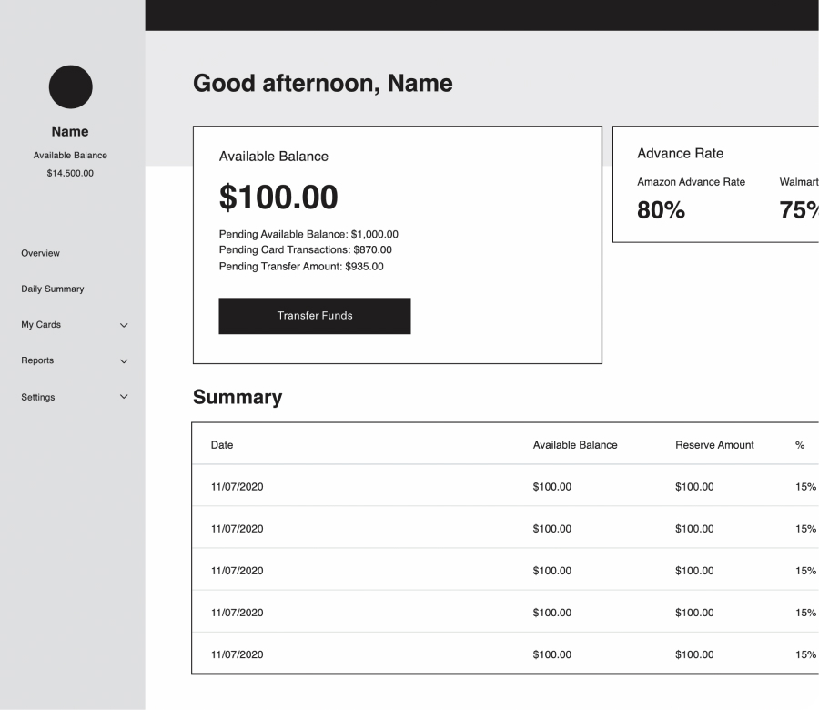
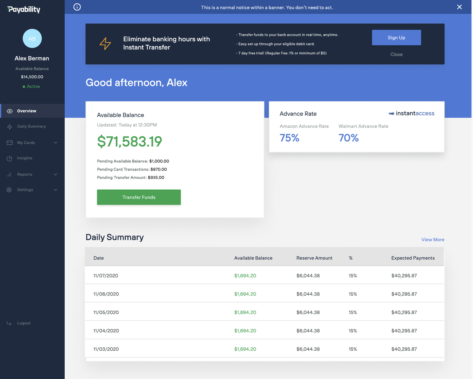
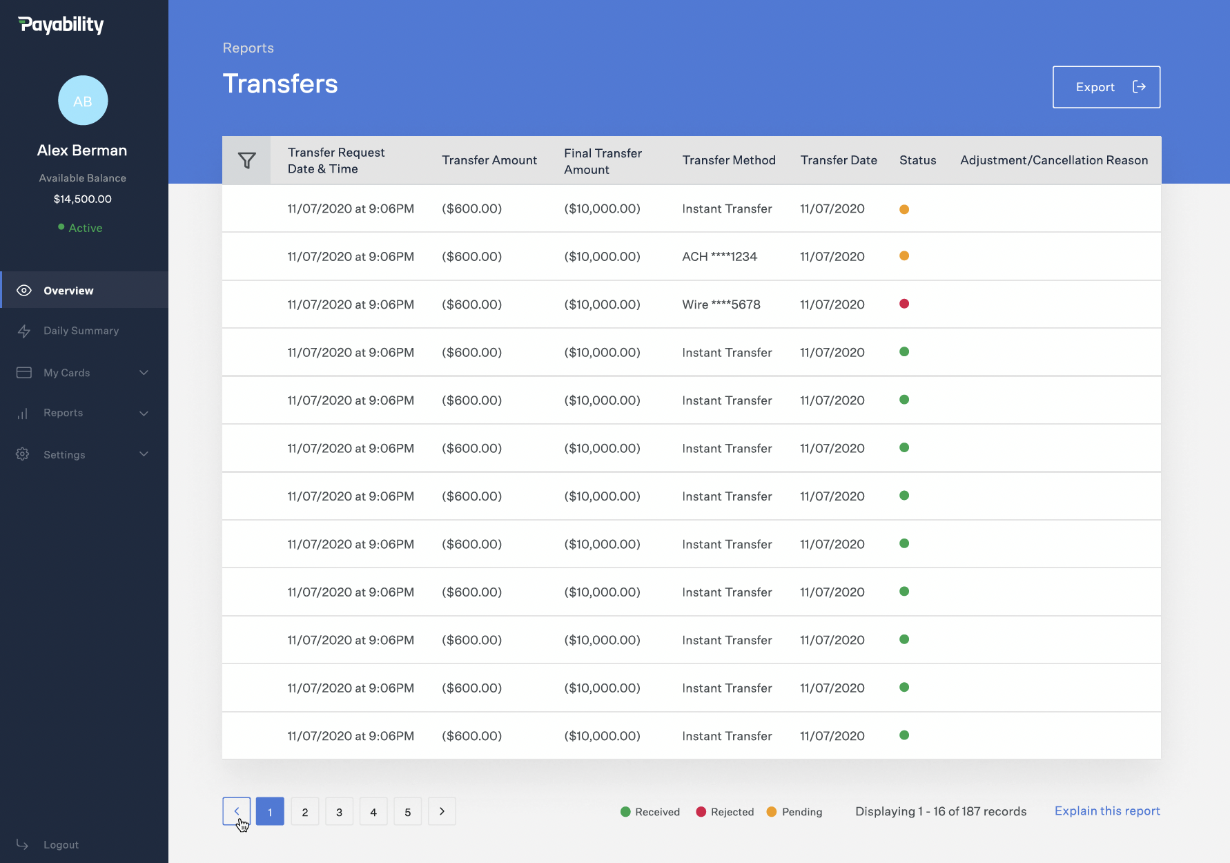
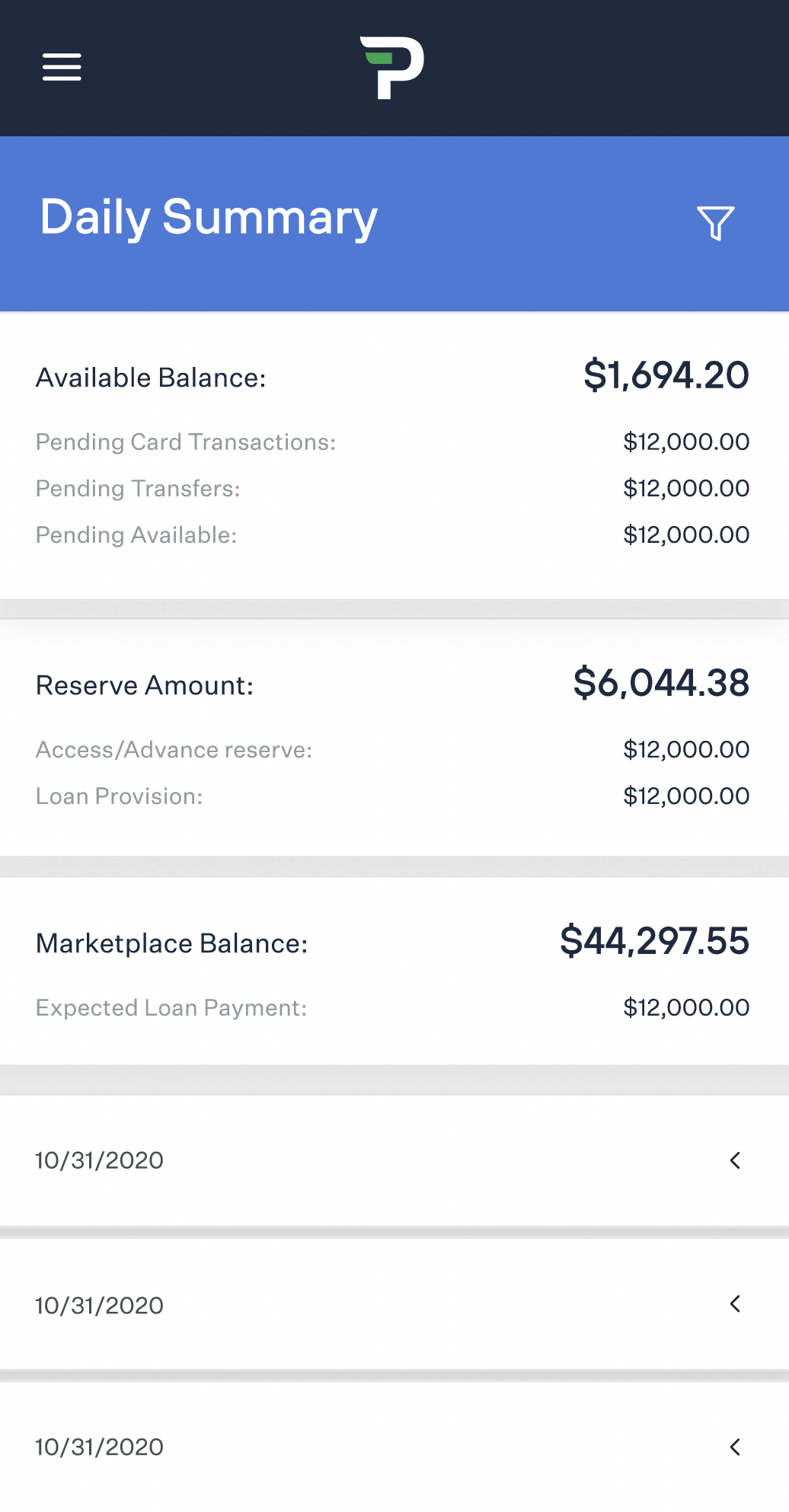
The daily summary page was a high-level snapshot of what users wanted to see daily. This included data from previous days (up to 10 days) and their current day. Included in the reporting were fees, reserve balance, available balance, due from the marketplace, and a host of other significant numbers. The challenge in this project was to communicate to the user in a simple way what was happening to their money as it came in and out of the system. When talking to customers, we discovered that we had two types of users: simple and power users. Our goal was to strike a balance between those two to meet both needs. To accomplish this, we knew the simple users wanted to avoid seeing the advanced reporting, and the power users did. We hid the advance reporting upon opening the page to meet the needs. The option existed to expand this report to see more details about where their money was going. This page resulted in users being much more satisfied with the reporting.
To match the rest of the brand, the old, outdated font was removed, and a new one was added that was more modern. The old, more bland colors were replaced with newer, easier-on-the-eye colors. The settings menu was optimized to make navigation easier and have a more logical information hierarchy. A page was created for users to sign up directly for the Payability Seller Card.
✓ Less churn based on easier-to-understand reporting
✓ Higher brand trust
One of my first tasks at Payability was redesigning the entire website from scratch to make it more user-friendly and aesthetically pleasing. Since the website was managed in WordPress, I had to work within the constraints of a preexisting theme and reconfigure the HTML, CSS, and JS to match the brand. I used Illustrator and Sketch to build custom vector graphics, iconography, and imagery for each page. I researched how other companies (Stripe, Betterment, and other fintech companies) designed, laid out and constructed their webpages. I listened to calls to the sales team in regards to confusion customers may have about certain parts of the site, and optimized based on that feedback and created landing pages for certain promotions and partnerships.
You can see this work live at https://www.payability.com
✓ Increased mobile speed by over 15% on Google page speed insights.
✓ Created higher brand affinity through consistency and aesthetics
Onboarding is one of the most important experiences and is frequently a potential customer's first impression of your company and product. This project took many months of user experience research, internal debates, and product iterations. This project aimed to create an easy and automated way for customers to sign up for Payability, connect their marketplaces, and get a genuine offer within minutes of applying. Since the main focus was automation, the user experience focused on ease of use. This provided many challenges regarding how this could be pulled off. As each marketplace is different and has its own rules and other procedures, much weight was put into research.
You can see this work live at https://supplier.payability.com/#/login/create
✓ Aesthetics aligned with the brand
✓ 120% increase in customers going live
✓ 110% increase in customers linking their marketplace
The goal of the Payability app was to increase customer retention by making the dashboard more straightforward, allowing users to check their seller card activity and keep up to date with their available balance. Through customer research and feedback, we noticed that many customers frequently check their available balance and activity on their seller cards. To ease access to this information, we created an initial MVP of the app that included just those features.
As a designer, I believe that a consistent brand is vital to the success of products and marketing. One of the first projects I completed while at Payability was the creation of brand guidelines. These included logos, colors, typography, UI elements, and brand rules.
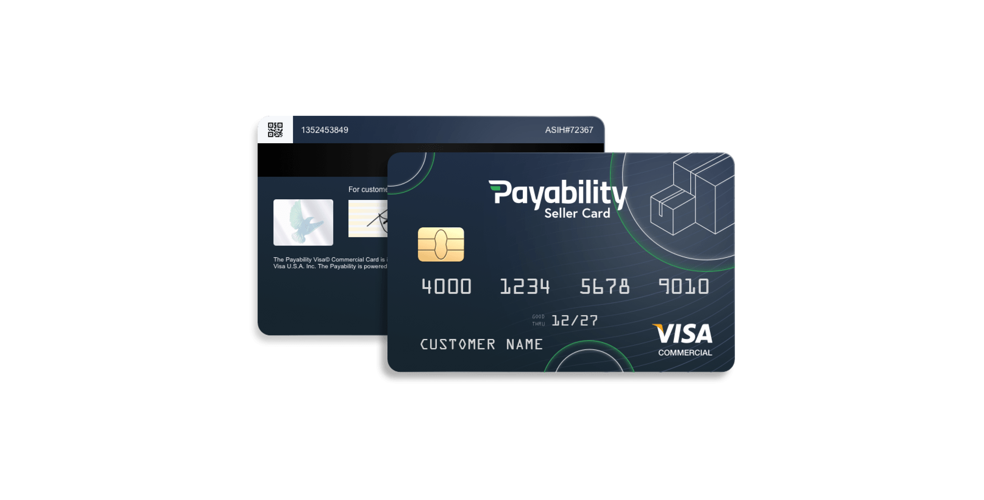
To offer payments to users who didn't qualify for Instant Advance or Instant Access, we provided them with a physical and digital credit card to get them into the Payability ecosystem. The goal was to intrigue customers into using it as their primary vehicle for inventory purchases. This meant the card had to be appealing. Since we felt it was optional for the customers to have input on the design, we went through multiple iterations on which the company voted. This meant the card was designed collaboratively and helped instill the importance of team decision-making within the company.
I mainly focused on color to allow users to differentiate from products easily. Instant Access (Daily Marketplace Payments) used our brand's secondary blue, and Instant Advance used the brand's primary green. Both logos employed glyphs that invoked the idea of speed. Since the Payability primary logo used a flag in the center of the "P," I wanted to incorporate that into both new logos. Both Instant Advance and Instant Access use arrows in different formats, yet they still feel like they are part of the brand.
✓ Higher brand trust and affinity
To manage all clients' information, configuration, and data, we built out an internal CMS. Because this information is proprietary, I cannot show an example of completed designs. However, since this was an internal tool, much of the design work was based on employee feedback and usage to create employee designs that achieved their goals easily and efficiently.
✓ Better experience for employees, which results in more efficient use of time
✓ Created higher brand affinity through consistency and aesthetics
While at Payability, I spent some time creating marketing assets to help build out the brand and bring in new customers. This meant creating ads, landing pages, convention and conference materials, and a suite of other marketing items.
I trained more in the UX/UI department; marketing initially came to me as a challenge. Although UX/UI and marketing are aligned in the idea of a customer-focused approach, they differ in several areas. One of those areas is customer acquisition. How do you get a customer to see the value in a product as simply and effectively as possible? This caused me to shift my mindset about how I approached design problems. I thought less about what the customer was trying to achieve and how we contextually placed this advertisement. Over time, I created over 300 new and optimized advertisements based on findings in click-through rates and impressions.
Partnerships were important to the company's sustainability. I created over 30+ prototypes based on potential partners' dashboards to implement the Payability product directly into their product. This meant recreating certain areas of other companies' assets in Sketch, taking that mockup, and making it into a working prototype that the Business Development team could use to communicate the idea visually. This work helped create partnerships with some of the lead companies in the e-commerce space.
✓ Direct-to-customer marketing opportunities
Outside of my passion for product design, I like to work in IT and cybersecurity. I helped manage the employment and delegation of new laptops to employees. This meant setting up all devices with the proper security software, user information, and passwords. Purchasing wires, monitors, cables, and other technology-related materials ensures all employees have the appropriate equipment to get their jobs done. In addition to this, I handled all A/V for company huddles, meetings, live streams, and other communication-related tasks. I monitored and handled all the deployment of routers, modems, and access points through Cisco.